Time-saving card creation techniques (Guest post)
Recently, fellow game designer, Chris Lauria, reached out to me to ask if I was interested in learning more about using Adobe Illustrator to increase card creating productivity.
I thought this would make a great article, so I asked him if he would be interested in making a guest blog post. Thankfully, he obliged and wrote the first guest post ever for the Board Game Design Course.
Let’s all discover some valuable tips from Chris.
Card design global editing using Adobe Illustrator by Chris Lauria
Hello, fellow game designers! And a big thank you to Joe for asking me to contribute to his blog.
My name is Chris Lauria. I’m a professional toy designer and illustrator. I’ve also worked on tabletop games, electronic games, and successfully licensed a card game concept many years ago. I’m currently developing several of my own game concepts, and plan on publishing them in the near future.
During my many years as a professional artist, I’ve always looked for time-saving techniques to speed up my projects. I’d like to share one of those tips with you here.
Game cards are a common component of many tabletop games. Assembling the card artwork can be tedious, especially if your game contains multiple decks and lots of cards. Whether you’re putting together your final card art sheet, or just a test deck, a minor change to your card design can require a lot of work. That is unless you’re able to easily make global changes. 🙂
If you are working with Adobe Illustrator, there is a simple method you can use to make global changes to your card design with one click. The Symbol Panel.
By converting your base card design to a symbol, you can achieve two very helpful goals:
1. You can make global changes to all of your cards at once whenever needed
2. You dramatically reduce your file size, and make your file easier to manage
I realize many of you may not be using Adobe Illustrator, and I don’t want to sound like a spokesperson for the app, but if you want to create print-ready professional looking game components, I highly recommend it. I believe you can still purchase older versions without a subscription that provide most of the features and functionality of the current version. For this tutorial, I am using Illustrator CC.
What is an Illustrator Symbol? A symbol is an art object that you can reuse in a document. You can then add instances of that symbol multiple times to your artwork without actually adding the complex art multiple times. You are not copying and pasting the same art over and over – You are adding a place-holder multiple times for one piece of art. Whenever you change the symbol, all instances of that art will change automatically.
Turning your card design into a symbol, then editing it, is very easy. I’ll explain this using some sample cards I created many years ago for a movie-watching card game I made called “Film Frenzy”. (Btw – I am in the process of completely redesigning this game)
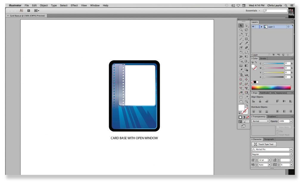
– The first image is my card base. You can see I left an ‘open window’ where the card images will be. (Fig 1) This is just the base artwork for the card. Any text, icons, or images are added on a separate layer.
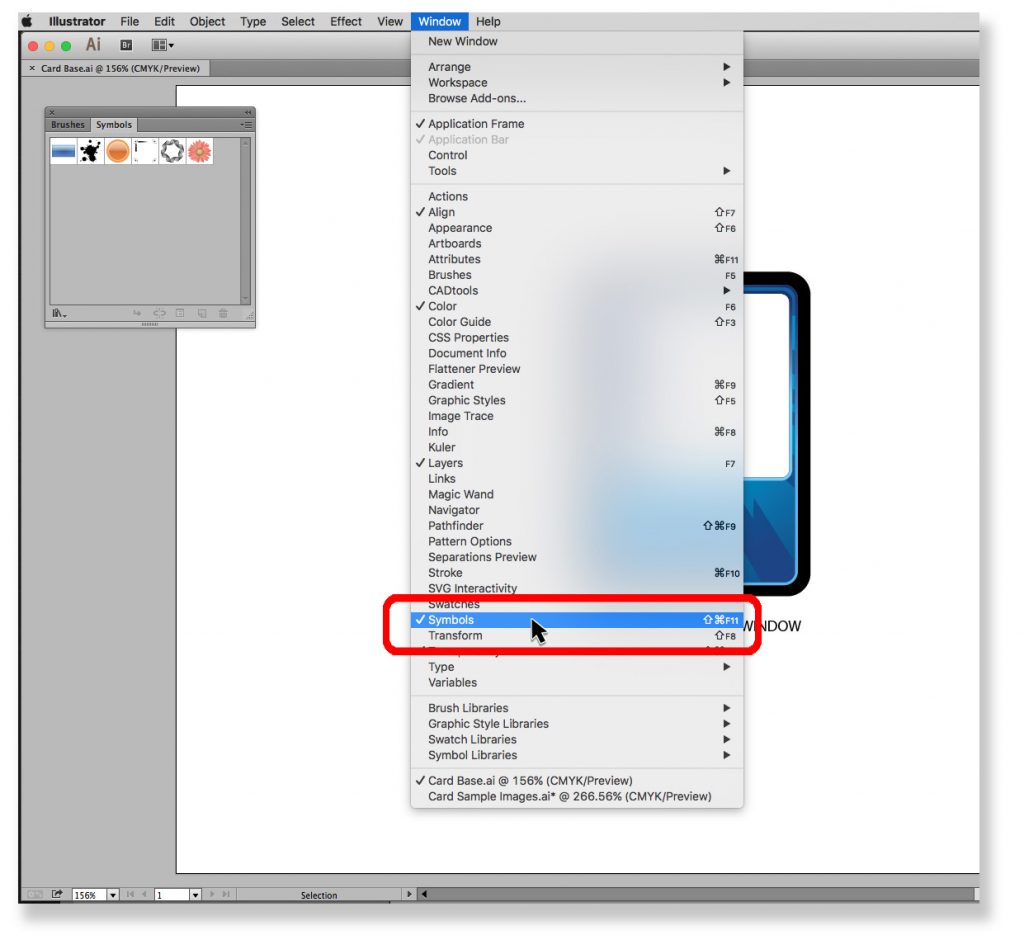
– Next, we’ll open the Symbol Panel: Window > Symbols (Fig 2)
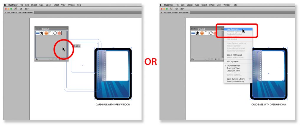
– Now select your card base artwork and either drag it into the Symbol Panel or use the Symbol Panel Menu and choose “New Symbol” (Fig 3A & 3B)
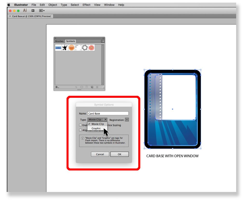
– You’ll get a small “Symbol Options” pop-up window where you can name the symbol and choose what type it is. (Fig 4) I’ve named mine “Card Base” and selected “Graphic” although I’m not sure if it matters.
– Once you click “OK” you’ll see your symbol in the panel (Fig 5)
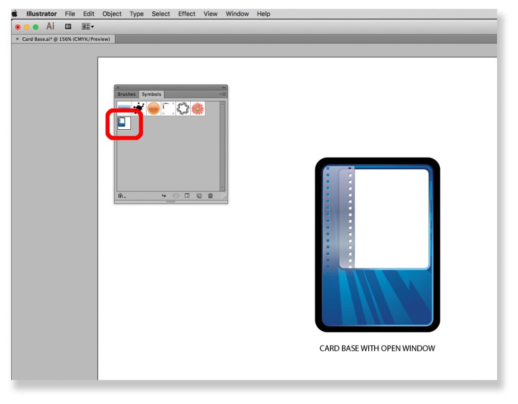
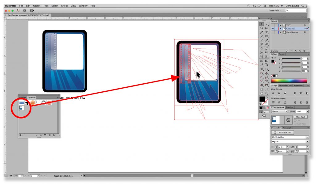
– Now you can simply click and drag the symbol from the panel to your canvas to place instances of the symbol as you need them. (Fig 6)
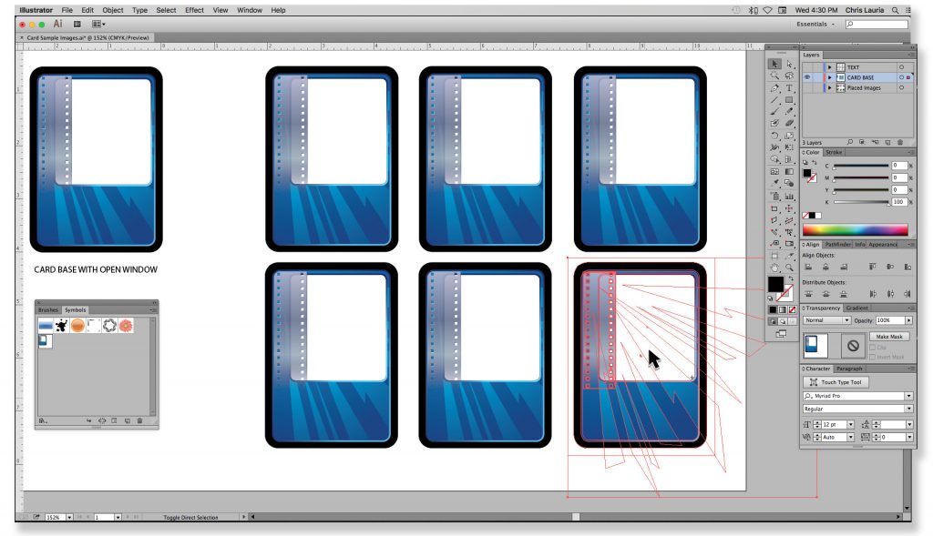
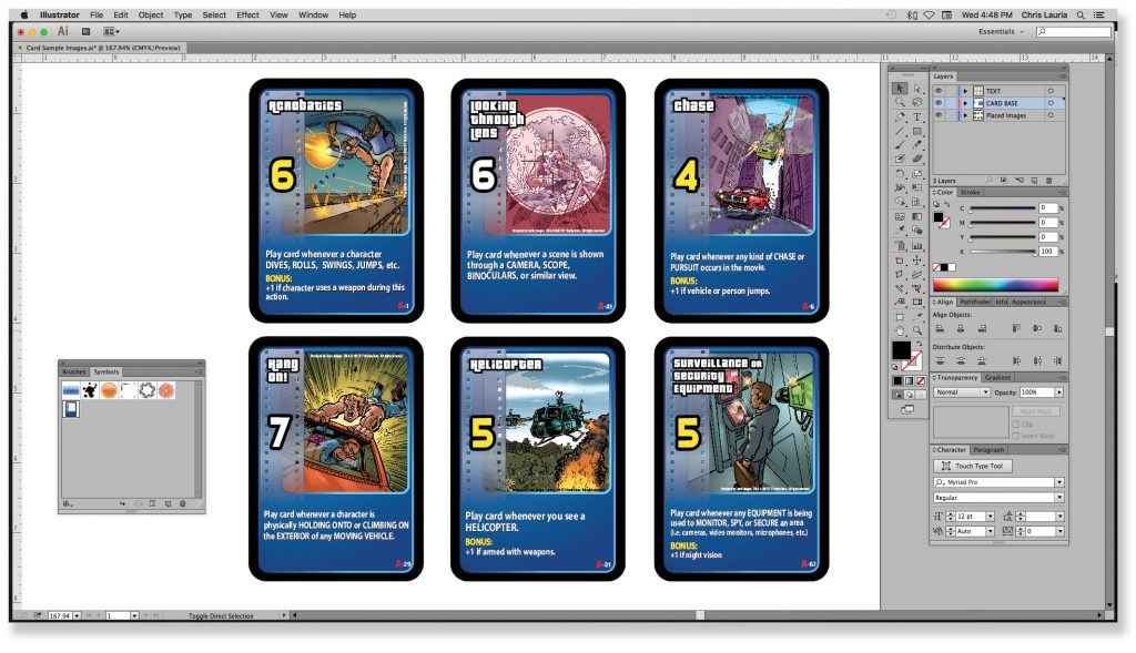
– I’ve gone ahead and placed several more symbols to give me a sheet of 6 cards. (Fig 7)
– You can see I’ve added my card text on a separate layer (Fig 8)
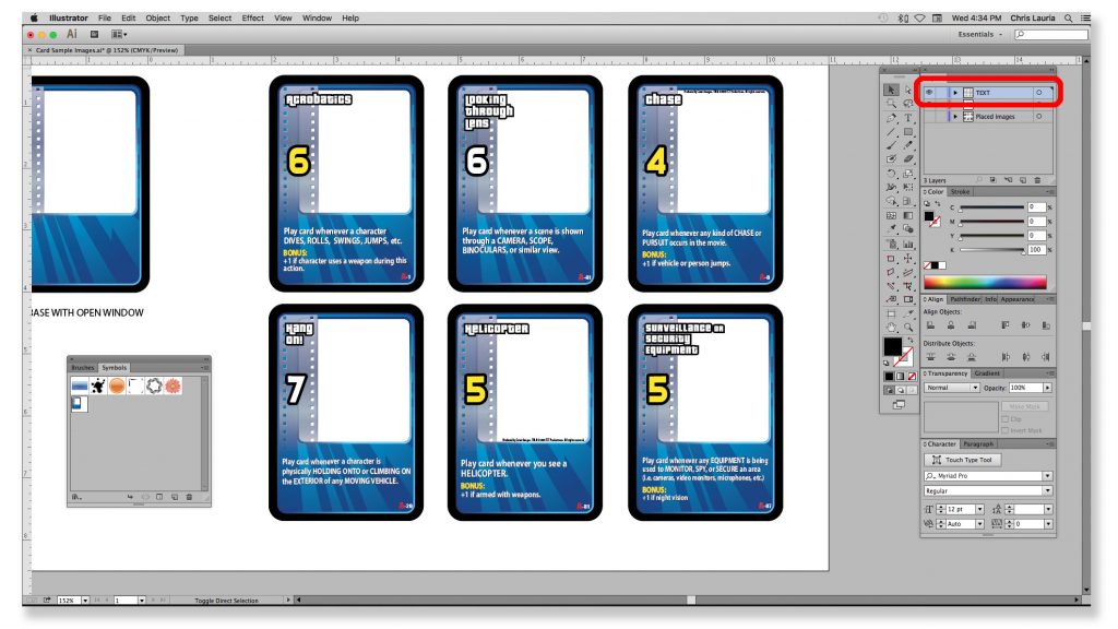
– I also placed my card images on a separate layer BELOW the card base since I have the open window in my design (Fig 9)
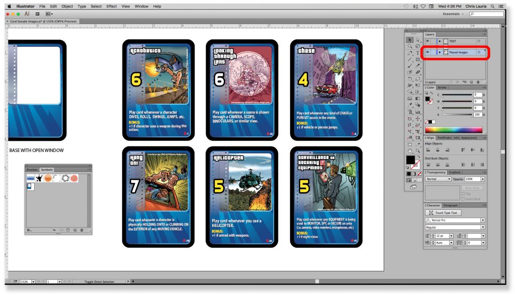
Now the fun begins! We’ve set up our sample cards, but I feel the ‘burst’ lines on the card base are too distracting and make it hard to read the text.
Normally, we’d have to manually delete the burst lines from each card. This could be a time-consuming process, especially if we had a sheet with a few dozen cards and complex art. Instead, we’re going to simply edit the symbol one time.
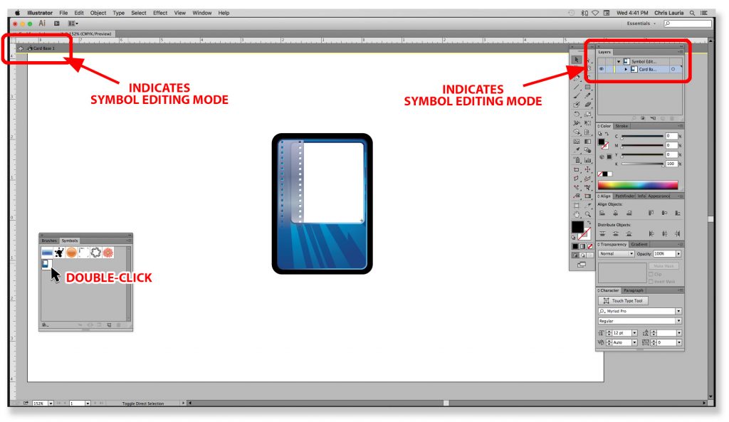
– In the Symbol Panel, double-click your card base symbol and you will enter the “Symbol Editing Mode” (Fig 10)
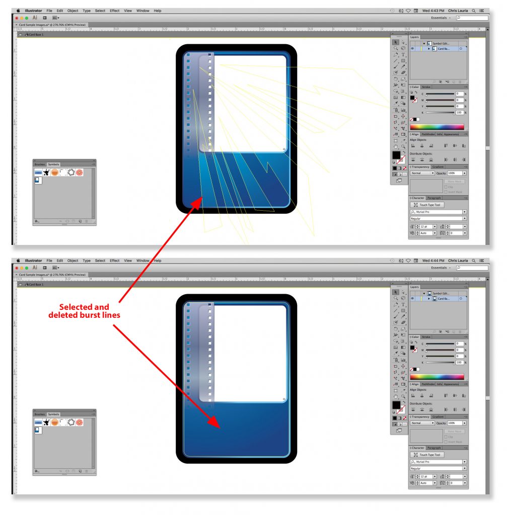
– Now edit the symbol as needed. In this case, I will delete the burst lines. (Fig 11 & 12)
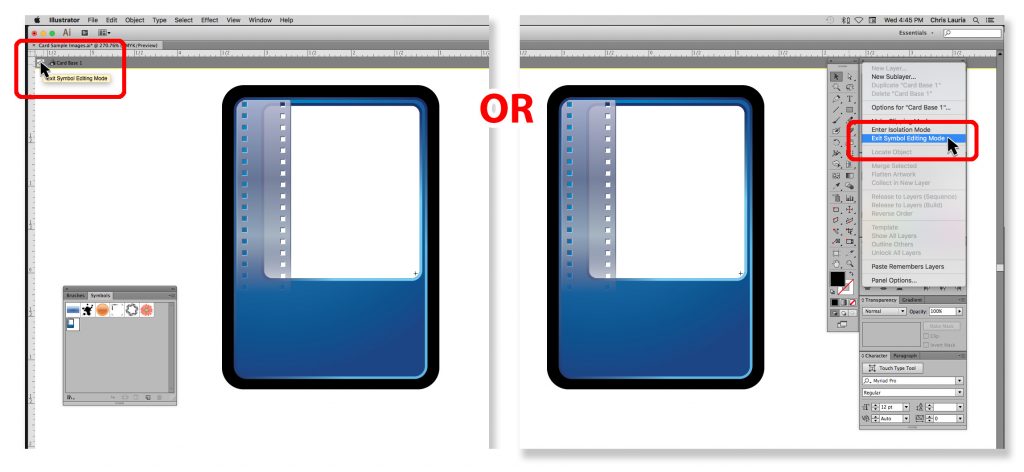
– Once you are finished, you can exit Symbol Editing Mode by clicking the arrow at the top left, or using the Layer menu and selecting “Exit Symbol Editing Mode” (Fig 13 & 14)
– As soon as you exit, you’ll see that all of your cards have been updated to the revised version. No burst lines. It’s like magic 🙂 (Fig 15)
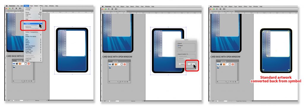
If for some reason you would like your symbol art converted back to a standard piece of artwork, simply select one the instances and go to Object > Expand. When the pop-up window appears, select OK. (Fig 16 A_B_C)
I hope this helps explain how to use Adobe Illustrator symbols with your card designs.
I’m sure there are many more ways to use symbols in tabletop game design. I was trying to find a time-efficient way to make global changes to my game cards, and this seemed to be the best way to do it.
I’d love to hear your thoughts and comments on this and other time-saving tips. Thanks for reading!
P.S. Feel free to check out my work here: https://www.coroflot.com/ChrisLauriaDesign
I always love learning new tips to be more productive. Thank you so much, Chris, for sharing this wonderful knowledge with all of us!
As Chris mentioned, please do leave a comment and let us know if you have any questions or suggestions for time-saving techniques in game design.

5 comments
Aaron Egerman
This was hugely helpful and came at the perfect time, thank you! I have already been doing a similar thing with all of my iconography so I can easily edit it and have it refresh everywhere, but didn’t think to simply leave the illustration window empty for the card layout. This’ll be a huge time saver.
Joe Slack
That’s fantastic, Aaron! I’m glad Chris’ guest post has been helpful for you.
Christopher Lauria
Hey Aaron,
Thanks! Glad the post was helpful. Obviously the open window design depends on your card design. It doesn’t always apply. I often like the break the boarders with card images. In that case, you’ll have to include a b/g color to you image and create clipping masks for elements outside the boarder. Sounds like another tutorial 🙂
Aaron Egerman
It ended up working perfectly for my card layout, luckily. Just one of those things where the obvious answer was right in front of me the whole time I was just too close to see it.
TiPhor
I’m a freelance logo designer and I use Illustrator for my game design projects, but I hadn’t thought of using it this way. This method will definitely help me out in the card making process. Cheers, Aaron.