How to Use Icons to Make Your Game Awesome
What the heck does that star mean? Or that question mark?
I guess I have to flip through the rules again…
You may not think about it too much, but iconography is such an important part of many games. When it’s done right, the game flow is seamless, but when it’s not straightforward you’ll be taken out of that flow by having to refer back to the rules or reference cards again and again.
If you want your players to have a better experience and maintain the flow of the game, it’s important to ensure that you’re using helpful symbols and icons, whether it be on your cards, boards, tiles, or other components in your game.
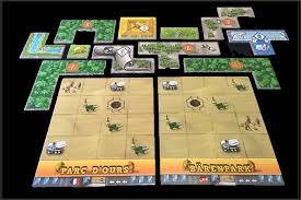
Here is an example of great use of icons in the game Barenpark:


Notice how the park tiles have symbols including wheelbarrows, cement mixers, construction vehicles, work crews, and bear pits. Each one of these is also represented on the main board to indicate where you can choose your next piece from based on which squares you covered in your bear park, or that you can add a new tile or bear statue to your park.
In addition, the main board shows how to easily set up the game without having to look through the rulebook. Based on the number of players, you select the pieces of certain values and include them on the main board.
Very simple. Very elegant.
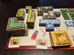
Here’s another example from the game Forbidden Island:

It’s very easy to see which tiles you must travel to in order to collect any of the four treasures. Also, the player starting tiles and helicopter pad are easily distinguishable.
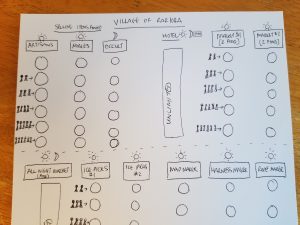
I just started working with a friend on a new game called Night Hawkers. I printed off a quick board to try out the concept and it felt okay, but a little bit dry.
Then I remembered what I had learned from these other games, and prototyped a much better board. I used these examples as an inspiration and made sure that all the spaces on the board were indicated clearly with the number of players, as well as which areas were active during the daytime and nighttime.

The next playtest was considerably better. Although the board was hand-drawn and not as attractive as the first version, it was much easier to understand and see what was going on.
What games have you played that have had really great iconography? What was it about the symbols and icons that made the game more intuitive and enjoyable?

9 comments
Andrew Dodd
Many thanks for your thought-provoking article, Joe.
Icons have come to mean a broad range, and “iconography” is often used to embrace anything that is non-text. But this is unhelpful, just as not all icons are helpful. I would make a distinction between images that portray an object and symbols that represent an idea. The first are very useful, but the latter can sometimes be mysterious, like Egyptian hieroglyphs or Chinese ideographs.
Any game that has a plethora of complex symbols is one that I struggle with. Terraforming Mars is a good example of a game that I much admire (though I don’t get enough opportunity to play) but whose iconography I find overwhelming. (I should qualify this by saying that my (never good) memory is deteriorating along with my eyesight, so my tolerance is set pretty low.)
So my advice is, never use icons without an icon lexicon, and always make sure that this is in the form of a player aid for each player. Nothing gives your gameplay away so much as continuously referring to some obscure description in the rulebook (like I did recently in Cockroach Poker!); but worse still is failing to understand the nature/limits of some icons, as I did in Terraforming Mars.
Joe Slack
Great points, Andrew! Especially about the icon lexicon. Players should always be able to understand the icons easily and reference aids with these icons are almost always a great idea.
Stephane Vaillancourt
Great article! But is there a way to have bigger images? It’s impossible to look at the examples you’re giving, even on my 27″ monitor! Haha! Thank you!
Joe Slack
Thank you for letting me know about that, Stephane! I’ve increased the size of the images. I hope they don’t show up blurry for you.
Doruk Kicikoglu
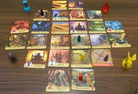
Please check the icons on the Ghost Meter in the Paranormal Detectives game! They’re perfect! I wish every game had such clear icons.
Joe Slack
Thanks for the suggestion, Doruk!
Steven Bollenbaugh
Thank you for a nicely informative article (and for increasing the size of the images.) I’ve done some web design and application for the Navy in the past and what you covered reminded me of the similarities between web user interface (UI) and user experience (UX) since the iconography and other graphic presentations serve as an interface between the player and the game. In addition to the points that you make we also needed to be concerned about was accessibility — as it would relate to games and iconography, this would include clarity of icon images, the use of color, and the use of conventions.
I have yet to get much into game design, but it seems to me that Steve Krug’s “Don’t Make Me Think” books might be of some interest. While they are aimed at web frontend designers, there is a lot that applies to any type of design, including game design. Here’s a short review by Jesse Showalter, a UI/UX designer:
Don’t Make Me Think | Steve Krug | UX Design Book Review
https://www.youtube.com/watch?v=vBzBgewl4ac
(Maybe check this out in a library first before buying to see how much of it one can relate to?)
——————————————
As long as I’m on a tangent … Sketch, Figma, and Adobe XD are applications used by web an application developers for design systems, layouts, iconography, information flow, etc. which may be of interest to some game designers. They also have some interactive capabilities which might be of use when developing game flow. Here are a couple of examples of their use by Jesse Showalter.
Better Icons with Sketch Layer Styles
https://www.youtube.com/watch?v=67ralD6gJTs
Building in Webflow & Design Systems in Figma
(Board Game design starts at about 6:13 into the video)
https://www.youtube.com/watch?v=Ejw-XHs3LMQ&t=373s
If one wants to try this sort of thing, I would recommend starting with the free version of Figma (https://www.figma.com/) which is quite capable.
I use Sketch (Mac only, $99)
https://www.sketch.com/home/
There is also Adobe XD ($9.99/month)
https://creativecloud.adobe.com/apps/all/desktop/pdp/xd
As long as I mentioned Adobe, I would also recommend considering Affinity Photo, Affinity Draw, and Affinity Publisher as alternatives to Photoshop, Illustrator, and InDesign. I have used all of these and haven’t lost anything going between them, I just find Affinity applications somewhat more modern in design and far far more economical.
Steven Bollenbaugh
Correction: The game design portion of the Jesse Showalter “Building in Webflow & Design Systems in Figma” video I referenced earlier starts around 8:40, not 6:13
My apologies, I couldn’t go back and edit my comment after it was posted.
Joe Slack
Thanks so much for sharing your thoughts as well as these great resources, Steven!